2022-04-19(e)an
CSS Clip-path and text transition with 2 colors
Today, i played with a simple css animations, using CSS variables, and clip-path.
The css clip-path property allows us to mask the rendering of an item, given a specific form.
In this example, i used the common "polygon" to make the item visible depending the value of the css variable --percent.
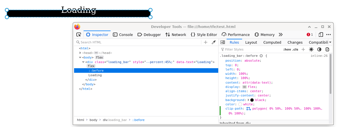
The code source is pretty simple:
<style type="text/css">
        body
        {
            display:flex;
            place-items:center;
            width:100vw;
            height:100vh;
            margin:0;
            padding:0;
        }
        .loading_bar
        {
            display:flex;
            align-items:center;
            justify-content:center;
            --percent:3%;
            position:relative;
            width:100%;
            max-width:500px;
            margin:auto;
            height:50px;
            font-size:30px;
            background:white;
            color:black;
        }
        .loading_bar:before
        {
            position:absolute;
            top:0;
            left:0;
            width:100%;
            height:100%;
            content:attr(data-text);
            display:flex;
            align-items:center;
            justify-content:center;
            background:black;
            color:white;
            clip-path:polygon(
                 0% calc(100% - var(--percent)),
               100% calc(100% - var(--percent)),
                 100% 100%,
                 0% 100%)
                ;
        }

    </style>
<div class="loading_bar" style="--percent:45%;" data-text="Loading">Loading</div>
A demo is also available..
 Tfe
Tfe